CASE STUDY
New brand architecture & identity for JCFS
Jewish Child & Family Services had been active for nearly 160 years and had grown to encompass a bewildering array of programs. We were charged with making sense of their brand family.
In anticipation of a pending merger with JVS Chicago (Jewish Vocational Services), Jewish Child & Family Services (informally known as JCFS) completed a new strategic plan which highlighted, among other things, the need for a stronger and clearer identity.
Leadership acknowledged a lack of clarity among stakeholders regarding their many program offerings and how they related to each other or the parent organization. Should JCFS appear as a “branded house” or a “house of brands”? As our client noted, several service sub-brands had developed their own brand equity with donors, staff, clients, and referral sources.
Our client also noted that their official name—Jewish Child & Family Services—appealed strongly to their core base of supporters but did not clearly portray the agency’s commitment to serve anyone in the Chicagoland area facing overwhelming challenges, regardless of age, religion, or race.
We were asked to recommend the most effective way to represent the agency, increase visibility to target audiences, and improve the agency’s appeal to a much broader spectrum of potential donors.
We conducted a full brand audit, including a competitive analysis of similar agencies and a thorough review of communications through various channels. Qualitative research included in-depth workshops and one-on-one conversations with leaders, major donors, small donors, and non-donors (both Jewish and non-Jewish).
We provided the board with our analysis, insights, and brand strategy recommendations, including a new positioning and messaging strategy, a hybrid brand architecture, alternatives for new parent and sub-brand names, and visual prototypes for marketing.
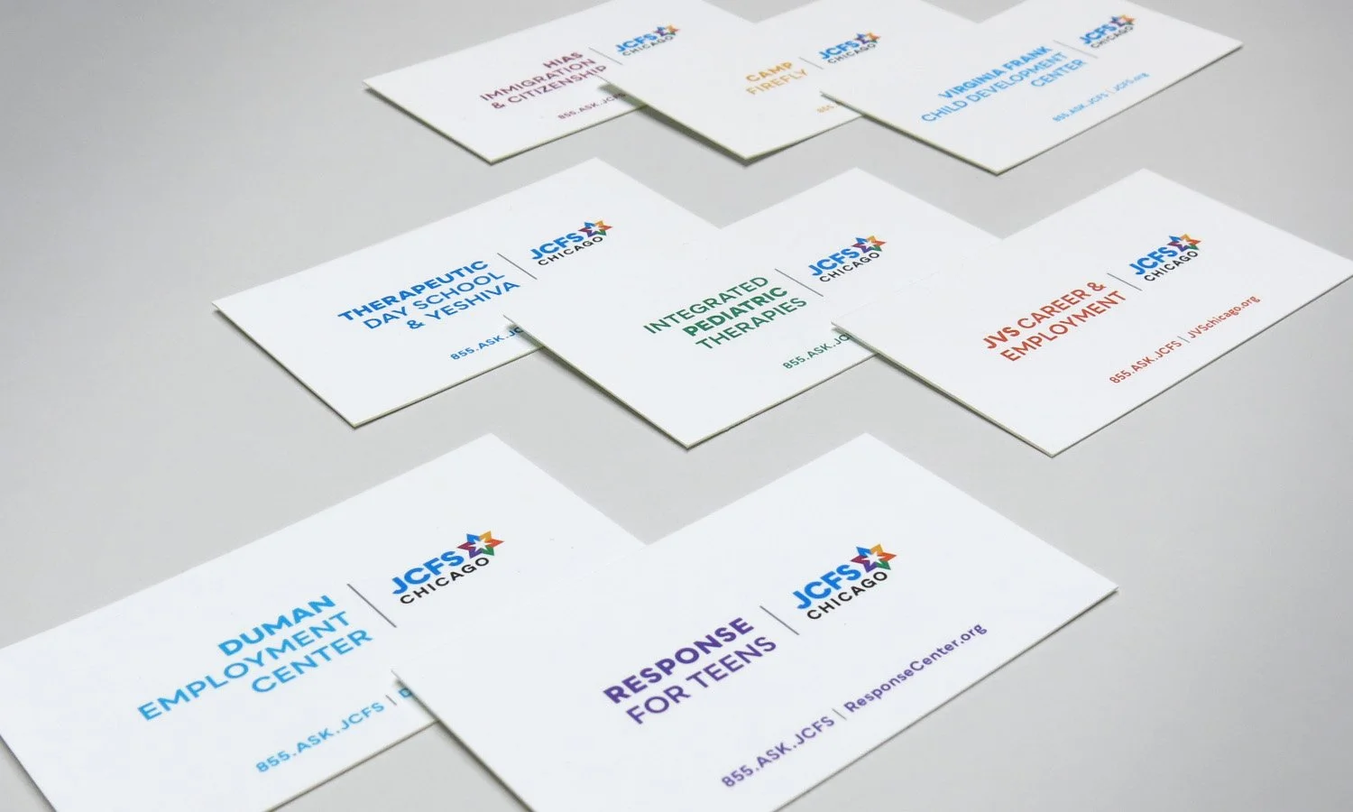
The name chosen—“JCFS Chicago”—allowed the agency to more easily depict its broad and inclusive mission and offered an acceptable compromise to all stakeholders. The bold new logo features a multi-color Star of David, representing the diversity of its services and clients, with the Chicago star at its center, representing its sense of community and geographical scope.
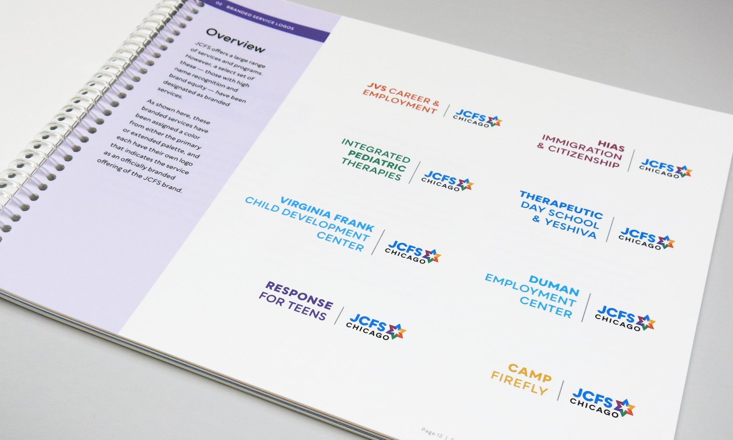
We also developed logos and identity systems for eight of their most prominent services in recognition of their existing brand equity. The new brand architecture reinforces JCFS’s position as a strong parent brand with a clear mission while celebrating the contributions and strategic value of each of the programs within its family of services.
With a comprehensive system of brand guides for both the parent brand and the endorsed brands, the new architecture lays a strong foundation for the organization to move forward with greater clarity and confidence. The JCFS Chicago leadership team moved quickly to roll out the new branding with pride.